Share your craft projects
Make new craft buddies
Ask craft questions
Blog your craft journey

Brian Benham
36 posts
and
13 followers
in about 3 years
in about 3 years
More from Brian Benham
Reception Desk for Art Gallery
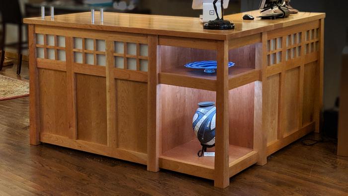
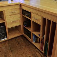
This reception desk was designed to fit the neighborhood in which the art gallery is located. It had an old craftsman-style vibe. We created a glass grid inset across the top of the desk to achieve this look. The gallery owner wanted an L-shaped desk with custom storage to fit everything she needed to conduct business—a place for bags, the cash drawer, and paper to wrap fragile items.
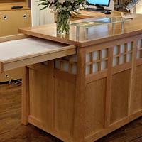
The desktop has a hidden drawer that pulls out for her to store packing paper and create a platform to set items on to be wrapped.
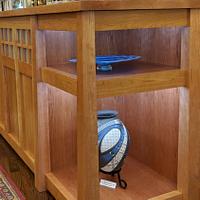
The challenge with L-shaped cabinets and desks is the dead space in the corner. I created a lighted display area to show off products to prevent this dead space.
The desk is made from cherry and features a glass check writing stand.
Thanks, Brian @ Benham Design Concepts
13 Comments
This looks great! The corner display is a perfect way to use that space.
The desk is art in itself. Great design, use of space, and the workmanship is even better.
Ron
Perfect for the setting. I love it.
--Nathan, TX. Hire the lazy man. He may not do as much work but that's because he will find a better way.
That’s beautifully done! One of my favorite looks.
Ryan/// ~sigh~ I blew up another bowl. Moke told me "I made the inside bigger than the outside".
Very nice! The owners must be thrilled!
beautiful craftsmanship befitting an art gallery. great video as usual brian. but what is this "check" thing you mention ? 😁
working with my hands is a joy,it gives me a sense of fulfillment,somthing so many seek and so few find.-SAM MALOOF.
Beautiful work.
One thing—it needs some type of door (maybe with a mesh) where the computer and power strip mess is.
One thing—it needs some type of door (maybe with a mesh) where the computer and power strip mess is.
yeah i agree about a door, and some cord containment ?
working with my hands is a joy,it gives me a sense of fulfillment,somthing so many seek and so few find.-SAM MALOOF.
That's beautiful Brian, nice work.
Very nice work Brian. Your projects always are stunning.
daveg, SW Washington & AZ
Great use of space and craftsman design. Build is excellent.
Well done, one that stands out. Very nice.
I fine piece indeed. I was wondering if you could’ve used one or two pieces of glass instead of all those little squares?
You’re a true craftsman Brian. It must be nice to make a living from something you love doing.
You’re a true craftsman Brian. It must be nice to make a living from something you love doing.
Dr. Quackner


