


Share your craft projects
Make new craft buddies
Ask craft questions
Blog your craft journey
RogerBean
77 posts
and
25 followers
in about 12 years
in about 12 years
More from RogerBean


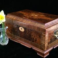
Cherry Pencil Box (#3)
")
")
")
")
")
")
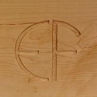
This is the #3 of 3 in my little design exercise in search of a “simple beautiful box.” This one is a little more “formal” in approach, of plain cherry, and with a lift off lid. It’s the same size as the first two, 8×4 x 1 3/8”. The traditional 1/16” stringing is maple. The lift is ebony, and the lid inlays are of black mother of perarl.
The interior is lined with chocolate brown leather. The cherry is very tight grain and lends itself to a more formal mirror French polish, where the first two boxes in the series were a satin oil finish.
The last photo shows this box and the two earlier boxes side by side. There’s more on the first two in my projects section. Those familiar with his work will recognize a certain homage to the work of Andrew Crawford. www.fine-boxes.com Each time I think I’ve come with something new, it seems Andrew has already done something much like it. Credit where credit is due.
In any event, if you have a particular preference for one of the three, or another comment, I’d like to hear it …and why. My goal was to come up with three attractive, but different approaches to the same box, and hopefully learn something along the way. The boxes are OK, but I’m not sure how much I really accomplished here.
I can relay what I think I learned:
Proportion in itself is important. Apart from the overall size proportions, wall thickness seems to bear on the issue of appropriateness. Too thin and the object looks spindly, or weak. Too thick and it seems bloated and clunky. An oddly shaped box just looks odd.
I began this effort leaning heavy on the idea of simplicity. But, minimalism is not enough. While there is a certain Zen beauty to pure simplicity, is seems to come up somewhat lacking in the final result for a box. A beautiful box needs more.
Decoration: I’ve come to believe the decoration is a large part of what makes a box beautiful. If no decoration is insufficient, then too much seems no better, possibly worse. The choice of type, quantity, and nature of decorative inlays, stringing, and edging makes a huge difference. For example, had I simply added a whole lid of burl, rather than the small bordered inlays of burl (on boxes #1 and #2), the result would have seemed somehow “less.” As small inlays, the burl seems to join the beauty of the burl with a sense of craftsmanship, that seems somehow more attractive. I think a lot about this and struggle with it on each project.
NOTE: There are exceptions. Martyn’s (Britboxmaker) wonderful visual illusions can be very bold, yet the box seems completely in harmony. I think this is because the illusion (design) is the focus, not the box, per se. The box becomes the canvas upon which the picture is painted. (Martyn, your opinion here would be welcome…) These little pencil boxes of mine are quite different though, and the box itself is the point, so the decoration is supportive rather than central. The complete box must speak louder than the decoration. (if that makes any sense) “Horses for courses” as they say.
Well, the next project is back to complex boxes. I learned here, I guess, that there is much more to learn.
Thanks for looking in.
9 Comments
So very nice Roger, a clean and impressive design.
woodworking classes, custom furniture maker
A very clean design with nice lines, the interiors are wonderful. Well done.
Main Street to the Mountains

simple yet elegant. some good ideas for our box swap coming up.
working with my hands is a joy,it gives me a sense of fulfillment,somthing so many seek and so few find.-SAM MALOOF.
Lots of good box makers here.
Main Street to the Mountains
Very nice!
Ryan/// ~sigh~ I blew up another bowl. Moke told me "I made the inside bigger than the outside".
Roger,
Beautiful design and execution. I agree with you on thickness of material on small boxes. I love the inlay and must give that a try.
Beautiful design and execution. I agree with you on thickness of material on small boxes. I love the inlay and must give that a try.
Petey

Beautiful boxes, Roger !!
Cheers, Jim ........................ Variety is the spice of life...............Learn something new every day

Cherry gets to that perfect color, and the line stringing, and those simple little dots are very nice embellishments that raise this box up very nicely.
Well done Nice design on the top
More from RogerBean