


Share your craft projects
Make new craft buddies
Ask craft questions
Blog your craft journey

Yes Paul. What I meant by editing while cutting is that I could choose to ignore detail that I didn’t want while in the process of sawing the pattern. I think I can do the same thing with this picture.
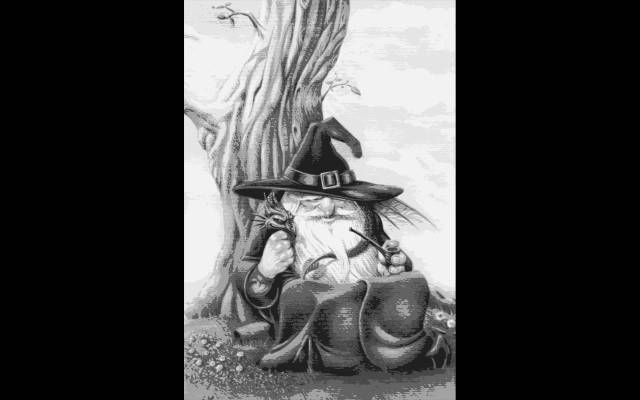
As you can see there are basically 4 tones throughout the drawing which are white, 2 shades of gray and black. If the darkest tone on the hat band was dark brown for example, then I could use walnut for the darkest tone, oak for the next darkest tone and so on. On the other hand, instead of using 4 tones i could choose to drop one of the tones and use only 3 graduated tones depending on what level of detail I wish to have.
One unanswered question in my mind is how I can successfully number the individual pieces to keep track of the different colors and also the cut pieces.
Here are the steps I think I did to get the tracing.
- Importing the photo into Inkscape
- Using the trace bit map option ‘grey tones’
- used file to order a print, then in options I chose single page and then chose print preview, the print.
- saved the finished image as a jpeg
- Put the jpeg image into my photo gallery for safekeeping
Here is the whole image where you can see the different tones so well throughout. I think this is just what I needed. I have been struggling with my hand traced design because of not knowing how to chose the right veneers for the shaded and light areas. This might solve that problem (I hope). You will have to zoom in on it to get a full appreciation the way the detail is presented.
Please let me know if what you think about this. With so little actual experience it’s difficult for me to judge.
Mike, an American living in Norway