


Share your craft projects
Make new craft buddies
Ask craft questions
Blog your craft journey

Mike40
1074 posts
and
35 followers
in about 12 years
in about 12 years
Inkscape for marquetry drawings
Paul and Roger Just to continue our discussion about computer programs for making marquetry designs. I downloaded Inkscape and have been fooling around with it a little.
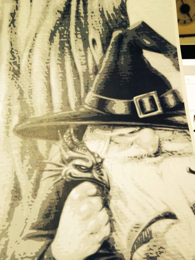
One nice surprise was when I used the bitmap option. I wanted to see if this would give me an outline of my wizard project. That didn’t happen as I am just in the ‘fooling around’ stage, but I did get an interesting shading which I think can be very helpful, both for selecting veneers and also to provide detailed cutting lines.
Here’s a picture showing what I mean. As you can see the different shades/tones are very well delineated and should serve well as a pattern without going to a line drawing. You might not think that would work, but I wound up using the artist’s picture of my dragon marquetry as my pattern and that made it much easier to cut. I did edit out a lot of unwanted detail while cutting which I can also do with the wizard. A good example of this are the 4 more or less graduated tones shown on the hat band. I’m sure this wouldn’t work for every type of motif, but maybe for ones like this.
I did follow some online tutorials for Inkscape a couple of years ago. I plan to go through them again.
Mike, an American living in Norway
7 Replies
While cutting? Did you say while cutting?
Can’t wait to see some progress shots.
This is quite impressive use of Inkscape. Are you cutting right from a copy of the photo above? I would still have to do a tracing for piece by piece which I prefer most of the time but for Boulle or PIW it should work well as is.
I have experimented with the auto trace features but I always cut from a 1/100" line now so I haven’t explored it to this extent. I will next time I’m working from a photograph.
The early bird gets the worm but its the second mouse that gets the cheese.
Yes Paul. What I meant by editing while cutting is that I could choose to ignore detail that I didn’t want while in the process of sawing the pattern. I think I can do the same thing with this picture.
As you can see there are basically 4 tones throughout the drawing which are white, 2 shades of gray and black. If the darkest tone on the hat band was dark brown for example, then I could use walnut for the darkest tone, oak for the next darkest tone and so on. On the other hand, instead of using 4 tones i could choose to drop one of the tones and use only 3 graduated tones depending on what level of detail I wish to have.
One unanswered question in my mind is how I can successfully number the individual pieces to keep track of the different colors and also the cut pieces.
Here are the steps I think I did to get the tracing.
- Importing the photo into Inkscape
- Using the trace bit map option ‘grey tones’
- used file to order a print, then in options I chose single page and then chose print preview, the print.
- saved the finished image as a jpeg
- Put the jpeg image into my photo gallery for safekeeping
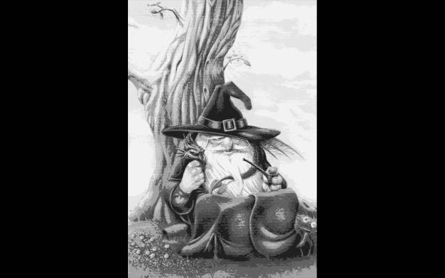
Here is the whole image where you can see the different tones so well throughout. I think this is just what I needed. I have been struggling with my hand traced design because of not knowing how to chose the right veneers for the shaded and light areas. This might solve that problem (I hope). You will have to zoom in on it to get a full appreciation the way the detail is presented.
Please let me know if what you think about this. With so little actual experience it’s difficult for me to judge.
Mike, an American living in Norway
There are a couple of ways to get colour gradients. Both were employed by the masters back when ….. One is graduated layering of different shades of veneers as you are doing here. The other is sand shading. I pick my veneers for the substantially different tones and use shading for the more subtle gradients. That is, of course, a huge over-simplification but you get the idea. Just don’t get all caught up and forget the sand shading aspect. Both techniques have their place.
The early bird gets the worm but its the second mouse that gets the cheese.
I can appreciate that. I plan to use sand shading, but I want it to be subtle, as you said. I think overdone sand shading becomes more pyrography than marquetry and I don’t want that to happen. I do love how it can bring life to a marquetry when well done.
The one problem with sand shading as I see it is the difficulty in controlling it, especially when it is somewhere away from the edges. I have a soup spoon for that the I have squeezed together in my vise/vice, ha, ha, to give it a funnel shape towards the tip.
Mike, an American living in Norway
It’s a great technique when it works perfectly. :-)
The early bird gets the worm but its the second mouse that gets the cheese.

Quietly following the discussion. Very interesting
Abbas, Castro Valley, CA
Your comment on the necessity of taking a tracing for a PIW marquetry seems right to me. Otherwise it will be too difficult locate the patches for accurate cutting. So no spontaneous editing is really possible. I will probably have to make a tracing of this. At least the shades are much better defined for my next tracing. Back to the light table!
Mike, an American living in Norway