lanwater
in about 12 years
Help choosing layout
Which layout would you choose for a buffet top?
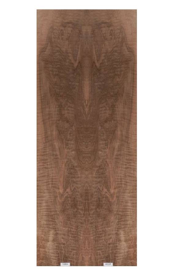
Original veneer:

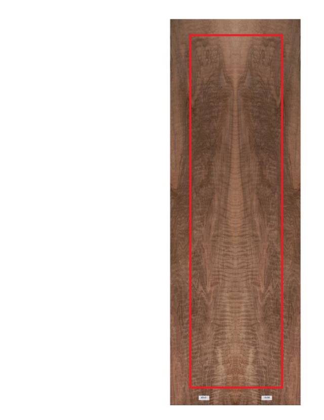
Layout 1:
Layout 2:
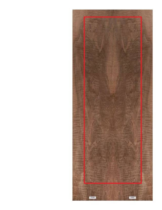
Of course any other layout is welcome as I am experimenting with the top layout at this point and have not made up my mind.
Thanks!
Abbas, Castro Valley, CA
40 Replies
I am not sure why the picture got placed all over the place…
Abbas, Castro Valley, CA
I don’t understand the red line. Is it the table top size? The aspect ratios seem different.
I like them both, maybe the first.
Also maybe remove some (or all) of the light from the centre if you have room. I think it adds more distraction than character. … Just me maybe.
The early bird gets the worm but its the second mouse that gets the cheese.
I like layout no. 2. Looks like an angle looking over the top. Interesting question though, both have their strong points.
Jamesw
It sems like you would get more figure going with layout no1. That being said, i like no2 personally. At the top there appears to be two figures high fiving over an oval table. Just my imagination, but im drawn more to it because of that.
I like layout #1, it’s got it going on all the way through the piece!
I see everyone is “reading” what the shapes are! That’s the cool thing about
Some veneers, there’s a story there as well!
However, if its a table top it will be covered somewhat, so myself, I would pick #1
Steve Tow
I like them both too, but It’s hard to tell without seeing the rest of buffet,but just going strictly on the photos I think I’d pick #1,
- seems almost too busy although it has amazing figure.
woodworking classes, custom furniture maker
Thanks for all the Input.
It was very difficult for me to choose one way or another. the figure on layout 2 are striking.
I know from past experience my wife tend to favor “light” pattern. I have not asked her input yet, I am concerned she is going to throw me way off :)
Paul:
The red lines represent roughly the part I would be using.
I am going to scale the pictures and do an accurate layout before ordering this particular veneer. This project has been taking a lot longer than I thought it would. Learning never stops.
I will try it without any of the light color in the center but I think I will loose some striking pattern along the center in doing that. It does not hurt to try anyway.
Abbas, Castro Valley, CA
Couldn’t resist:)
Layout 2 with much less light colors in the center. I will experiment some more.
Abbas, Castro Valley, CA
Both are definitely interesting. I prefer #1 because as others have mentioned, the pattern seems to have a better flow though the entire length. Either way, it is an interesting grain pattern.
Mike
Mike - Waukesha, WI
If you really stare at lay out 2 it looks like a tribal mask. You can pick out eyes nose etc.. so with that said I see a North American Indian table here. Maybe the front two legs as todum poles and other art work brought into the skirt. Just a thought.
Jeff Vandenberg aka "Woodsconsin"
I like #3 Abbas. Just me maybe but as I said above, I find the light colour more of a distraction than a feature.
The early bird gets the worm but its the second mouse that gets the cheese.
Thanks Paul.
I agree about the light color being a distraction.
Abbas, Castro Valley, CA
Bently! Thanks my friend.
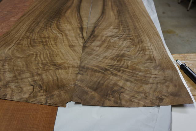
I forgot I have that one…
I have to bring it down and try it.
Abbas, Castro Valley, CA
Ooh I like that last picture. That grain is way way cool. I can see that seriously pop
Jeff Vandenberg aka "Woodsconsin"
The last one is pretty intense.
Thanks!
Abbas, Castro Valley, CA
WOW!!!!
Jamesw
Wow i love all of them. Ok time to build something with all of them.
Jeff Vandenberg aka "Woodsconsin"
With all of them, I will go broke:)
One of them coming soon. As soon as I figure few things.
Abbas, Castro Valley, CA
The old saying…. Go for broke or go home and sit with the garden gnome. Lol lol
No we dont want you to go broke. Those were some awesone pieces though.
Jeff Vandenberg aka "Woodsconsin"
I like the old saying :)
Abbas, Castro Valley, CA


