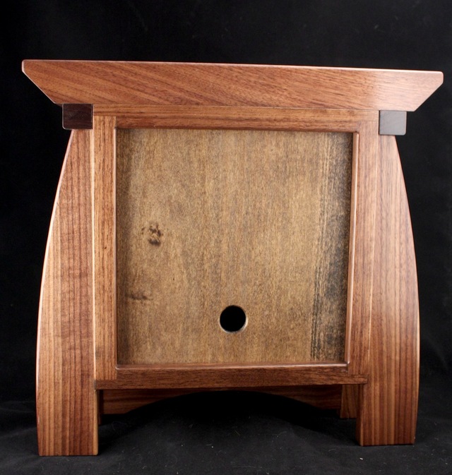
This project is more about the clock face than the clock for me. The clock is based on a previous version with some improvements. The basic model of the case came from viewing 10K pictures of clocks, fun!
Dimensions: top 13-1/2"W x 5-1/4"D face 7-3/4" x 7-3/4" body is 4"D
Walnut, jatoba accent, poplar back. finish is Danish oil and satin precat lacquer.
The back lifts up and tips out for access to the clock motor (quartz electronic). The arch on the bottom is removable to allow the glass to slide out if it ever needs to be replaced or the motor needs attention. Eventually one or the other will have issues.
The jatoba accent around the face is to cover up for a mind fart where I mixed up the top/bottom and sides and exposed edge grain 8^)
Every thing is at a slight offset from everything else. This keeps it interesting and means I don't have to get all these surfaces to align.
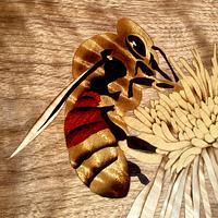
I've made copper clock faces before since I really love the metal. Plenty of ways to dress it up.
Basically I like to make them like printed circuit boards are made. Create a design, use the design as a mask on photosensitive acid resist applied to standard FR4 copper plated fiberglass, etch away copper to expose the design.
The technique is easy and very precise, producing crisp lines and shapes. One feature of this method is the color of the backing fiberglass is exposed where the copper has been etched away. With black fiberglass, the copper contrasts beautifully as long as it is polished and sealed to stay that way.
The problem is I like to patinate the copper to get the cool effects and colors. The black fiberglass no longer works as a secondary color since it is, well, too dark 8^)
A limited set of other colors are available, but something like yellow just doesn't work with my design. Another problem is doing the patina and trying to keep the background colored area clean. It just ain't easy!
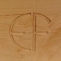
Here is a former projects clock face. Black FR4 with a slight patina. It looks ok, but kept getting darker and darker over time.
The solution?
Only way is to etch completely through a solid copper plate, then I can patina the copper anyway I like and place it over a suitably colored background.
The results are much more satisfying:
This is an ammonia/salt patina which produces some vibrant blues and is easy to create. The background is a layer of polished copper.
I used an 8" square piece of 24 gauge copper. It needed to be flat and rigid for the photo resist film to be easy to apply and not crack from flexing.
The problem is with this added thickness, the etching solution (muriatic pool cleaning acid and hydrogen peroxide) begins to undercut the design as it eats its way to the other side. This has the effect of blurring details, but I was happy on this first try.
Copper is expensive so I've though of some ways I can use thinner material (possibly 30 gauge) and get better results.
This used Mohawk products. They are easy to get in my area and I'm also a fan of pre-cat. It's nice to spray the sealer, wait 30 min, scuff and apply several coats of the lacquer. If sprayed well, there are no dust bumps or other crud that would require a finish sanding (A job I detest)
Another beautiful project full of one fine detail after another. Your designs always inspire me. Too often I get in the "finish line focus" but taking the time to really consider and incorporate the "extras" is the sign of a craftsman. You are a great example. Thanks for sharing all the background.
My strategy always seems to end with pimping it out. Plan/build the basic item, then try subtle mods to see what looks better. I'm always amazed at what a small chamfer or shadow line can do for a projects appearance.