Share your craft projects
Make new craft buddies
Ask craft questions
Blog your craft journey

Norman Pirollo
164 posts
and
18 followers
in almost 6 years
in almost 6 years
More from Norman Pirollo
Display Cabinet (Ash)
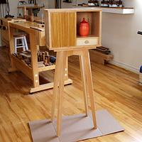
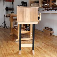
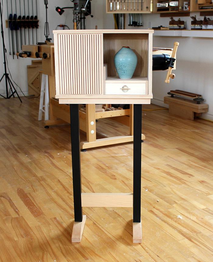
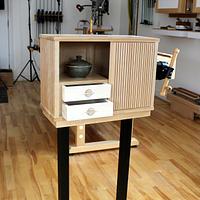
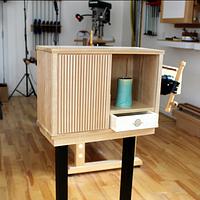
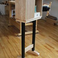
A recent furniture piece involves tambour sliding door and metal legs. I have wanted to incorporate a sliding door into my furniture for a while and seized the opportunity with this latest piece. Also integrated is a set of metal legs. The dilemma I faced was the minimal depth of the cabinet at 8 inches. The original design was to include a stand with 4 wood legs but stability was a concern. I would need to add Bird's Feet at the bottom to add stability (by increasing the depth of the stand). This to avoid the risk of tipping forward. So this metal stand solved this problem and created a new wood, metal aesthetic. Wood selection took a while as I wanted a consistent grain pattern throughout.
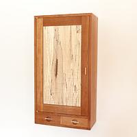
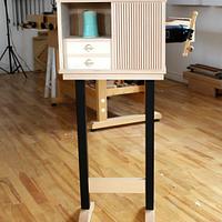
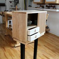
The interior has (3) dovetailed drawers with Holly drawer fronts. The interior drawer compartment layout is staggered and introduces asymmetry into the design. I used Ash for the cabinet. Ash is a wood I rarely use in my work and wanted to experiment with it. I like the fact that it is a naturally light wood and retains its color,,, unlike Cherry for example. I had a plank of pure white Holly that I also wanted to use in a furniture project. Incorporating the Holly for drawer fronts would complement the light-colored Ash. The sliding tambour door was an afterthought and therefore presented a bit of a challenge to get right. It worked out in the end with some judicious wood matching. I learned a few techniques in this furniture build. I will be creating more work with this type of sliding door design in the future. The cabinet and stand are diminutive in size at only 42 inches tall. It has a frame and panel back so there is no issue placing it away from a wall (Krenov philosophy). Last few images in series have a thinned, shellac finish applied.
The interior has (3) dovetailed drawers with Holly drawer fronts. The interior drawer compartment layout is staggered and introduces asymmetry into the design. I used Ash for the cabinet. Ash is a wood I rarely use in my work and wanted to experiment with it. I like the fact that it is a naturally light wood and retains its color,,, unlike Cherry for example. I had a plank of pure white Holly that I also wanted to use in a furniture project. Incorporating the Holly for drawer fronts would complement the light-colored Ash. The sliding tambour door was an afterthought and therefore presented a bit of a challenge to get right. It worked out in the end with some judicious wood matching. I learned a few techniques in this furniture build. I will be creating more work with this type of sliding door design in the future. The cabinet and stand are diminutive in size at only 42 inches tall. It has a frame and panel back so there is no issue placing it away from a wall (Krenov philosophy). Last few images in series have a thinned, shellac finish applied.
I created a 3-part series of the actual making (overview) at my YouTube channel. Link to Part 1:
Norman Pirollo
9 Comments
beautiful norman. i agree about the black legs, the white didn't work.
working with my hands is a joy,it gives me a sense of fulfillment,somthing so many seek and so few find.-SAM MALOOF.
Looks good and gives a nice, subtle contrast to the ceramic pieces, goes well together. Ash works great and gives the cabinet a touch of class (IMO).
The base looks a a little heavy detached. It could be interesting to see this cabinet just hang on the wall insted, perhaps a way to go?
Would love to photos from more angles and close up of details
The base looks a a little heavy detached. It could be interesting to see this cabinet just hang on the wall insted, perhaps a way to go?
Would love to photos from more angles and close up of details
"The good chair is a task one is never completely done with" Hans Wegner
beautiful norman. i agree about the black legs, the white didn't work.
I replaced images with white legs instead with more detailed images of the cabinet itself. Agree about the white stand, although some people preferred it. Definitely the minority however.
Norman Pirollo
Would love to photos from more angles and close up of details
I just posted some new, fresh images at different angles and with some drawer detail.
Norman Pirollo
I just posted some new, fresh images at different angles and with some drawer detail.
Cool, thanks. The grain on the sides of the cabinet goes realy well with the tambour door, good match!
"The good chair is a task one is never completely done with" Hans Wegner
Nicely done!
Ryan/// ~sigh~ I blew up another bowl. Moke told me "I made the inside bigger than the outside".
A nice cabinet, hte drawer pulls look really nice. Everything ties together well. Well done.
Main Street to the Mountains
Thanks all for the excellent feedback!
Norman Pirollo
Wonderfully done - all the details & colors play together nicely. Including the vases!


