Share your craft projects
Make new craft buddies
Ask craft questions
Blog your craft journey

Martin Sojka
592 posts
and
5311 followers
in over 12 years
in over 12 years
Major Design Revamp
WoodworkingWeb gets a major design revamp today.
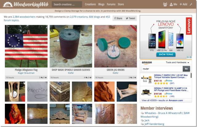
Before:
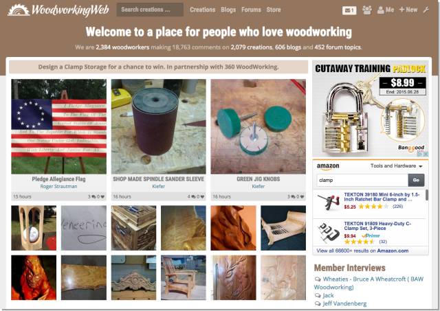
After:
Let us know what you think.
Martin Sojka, Maker of Craftisian
14 Replies

It’s pretty subtle but does seem to add complexity to a previously clean design.
Either/or … I’m not bothered by the new look.
-- Alec (Friends call me Wolf, no idea why)
While you are at it, could you change ‘Creations’ to Projects.
‘Creations’ always makes me think of Frankenstein for some reason.

Looks pretty good to me Martin, changes are subtle enough not to change the navigation of the page.
Kevin
I like the lock a lot better than the cell phones. Rest of it looks better too…
I'm the one with the beard
Every aspect of this site is fantastic, and yet you continue to make it better for us all. Thank you Martin.
CHRIS, Charlottetown PEI Canada. Anytime you can repurpose, reuse, or recycle, everyone wins!

I like the older header better. I was slimmer and less intrusive.
The slogan “Welcome to a place for people who love woodworking” could be slimmer, maybe left aligned.
I don’t see the “wrench” icon, maybe it appears under certain condition.
Abbas, Castro Valley, CA
I tried it while I was logged out to see if the “wrench” appear there, no dice.
While I was logged out I notice a pretty colorful advertising banner right in the middle of the brown header. It just steel the show; almost screaming “let me out of here…”.
Just some input Martin. I do appreciate all the improvements you have been making to an already great site, Unlike the other sites.
Thanks!
Abbas, Castro Valley, CA
I like the new look. Not fond of the advertising in the middle of the header but I understand that without advertising we could not have this great site. You do a great job Martin
Anna
Thanks for the feedback. To address some points:
“I like the older header better. I was slimmer and less intrusive.”
The idea was to make a bolder statement with a new header. Notice that now it contains page title too so in total the height is almost identical as before. Plus it collapses to a thin navigation bar when you start scrolling.
Wrench icon is only for site admins :)
The banner in the middle of the header was there before the change too. It is only displayed to guests though and disappears when you sign in.
Martin Sojka, Maker of Craftisian
Thanks Martin.
I did see the title and the “collapsing” of the navigation bar. I thought that was cool.
Abbas, Castro Valley, CA
Looks good, thanks for providing this for us!

I like the change
Wheaties
Thanks Martin, I like the changes !!
Jaybird
Thanks, glad we have more and more likers :)
Martin Sojka, Maker of Craftisian