


Share your craft projects
Make new craft buddies
Ask craft questions
Blog your craft journey

Martin Sojka
592 posts
and
5311 followers
in over 12 years
in over 12 years
More from Martin Sojka
New project: ShutterClick - Expert photo critique, on demand
Craftisian Labs #13: New Craftisian Plus Members page
Craftisian Labs #12: Your space, your rules — introducing Blocklist
Craftisian Labs #11: Introducing Craftisian Zero & Plus - support the site, lose the ads
Monthly Book Giveaway #6: March 2023
New finely crafted logo and design updates
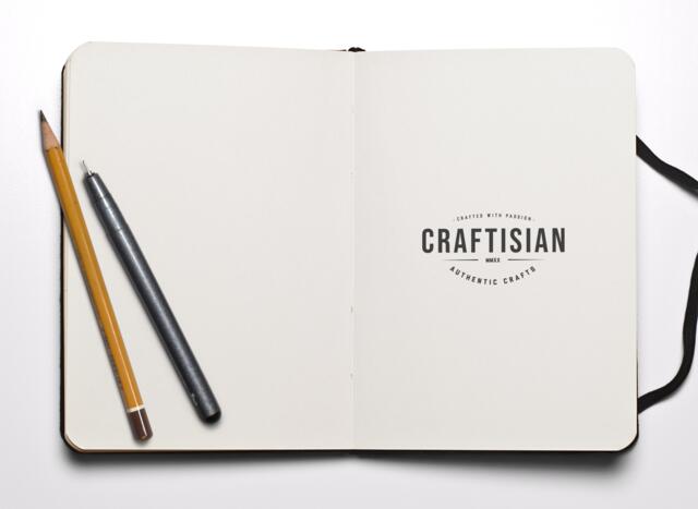
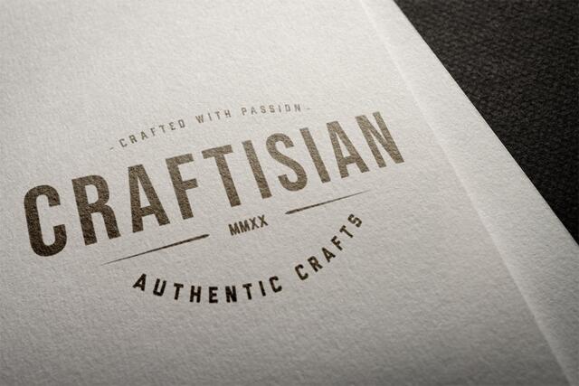
New logo design has been inspired by the era of traditional crafts. It has a vintage yet modern feel to it and it sits boldly in the center of the header area. I even added two supporting texts to it: “CRAFTED WITH PASSION” and “AUTHENTIC CRAFTS”. They describe the direction of the website nicely.
There is also a change in the names and intentions of the two major site sections. Blogs are changing to Updates and Forum is changing to Discussions. Feel free to start sharing your workshop updates more frequently and participate in the discussions of your favorite crafts.
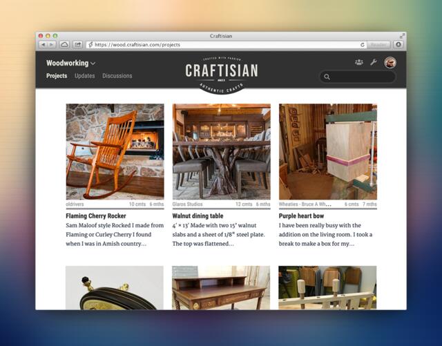
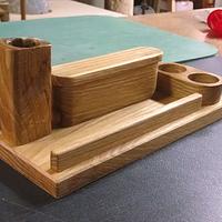
Projects remain the backbone of Craftisian and their listing now has a more substantial design with the titles and excerpts featured just under the images:
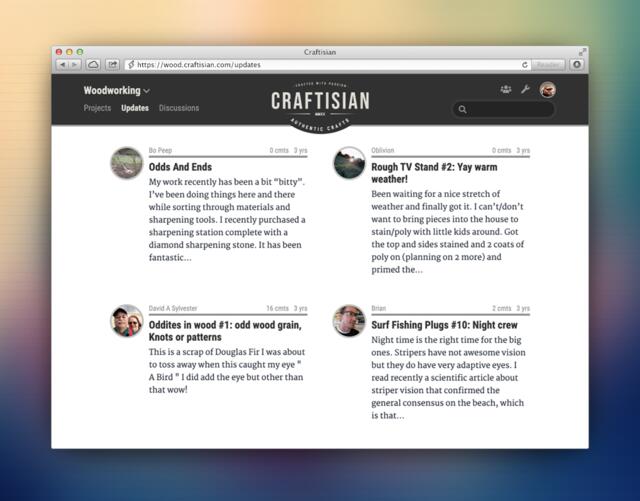
Updates (former blogs) are now displayed in the column layout to make the page visually more pleasing:
I am pleased with these changes as they solidify Craftisian as the project showcase website for the authentic craftisians. And my hope is that the website itself is not lagging behind the quality of your projects anymore :)
Any feedback is appreciated as always.
Thank you.
Martin Sojka, Maker of Craftisian
6 Comments
I like the logo. You kept to the K.I.S.S. principle, and maintained a less-is-more visual. Good job.
Love this. Finely crafted indeed!
Looks AND feels right.
I, too, love it — very Martin-ish :)
Clean, simple, powerful.
Now, form us to start building the site through our posts
JAGO - just a grandma’s opinion
Perfect, I’m glad you like it, guys.
I’ve just updated typography on Craftisian. Enjoy.
Martin Sojka, Maker of Craftisian
I really like the Blue instead of the black.
—Madts.
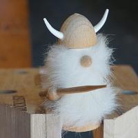
Tor and Odin are the greatest of gods.
looks great!
Angellos
More from Martin Sojka
New project: ShutterClick - Expert photo critique, on demand
Craftisian Labs #13: New Craftisian Plus Members page
Craftisian Labs #12: Your space, your rules — introducing Blocklist
Craftisian Labs #11: Introducing Craftisian Zero & Plus - support the site, lose the ads
Monthly Book Giveaway #6: March 2023