


Share your craft projects
Make new craft buddies
Ask craft questions
Blog your craft journey
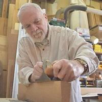
shipwright
2073 posts
and
113 followers
in over 12 years
in over 12 years
More from shipwright


Family Portraits .... or Cutting My Wife's Hair with the Chevalet


One of the things that Patrick Edwards has always done in the level one course at ASFM is to have the students do a self portrait. The school keeps one copy and gets to have a visual record of all the past students. I really like that part and plan to incorporate it into my new level one course as well.
With my first group of students arriving next week, I decided to do a dry run to see how my photoshop skills were for producing the high contrast print that the students will trace for their self portraits. I used my wife and myself as guinea pigs.
ASFM students are instructed to take a “less is more” approach when producing their tracings and I will offer the same encouragement to my students but as I had already done that when I took that course, I decided to take the opposite approach at least with my wife’s portrait, just to see how it would work.
I learned a couple of things.
The first is that the positive (light ground, dark shadows) always looks good but the more detail you include the worse the negative looks to the point that the very detailed cut of my wife is hardly recognizable as a face in the negative.
The second is that the line drawing never looks like it is going to work out well at all. Again it is more depressing with more detail.
You gotta have faith in the process however because they actually all work out when cut and assembled. You usually can’t believe how good they do look.
The bottom line is that I think I can do the prints well enough and I got some rather nice family portraits out of the experiment. …… Makes me a happy camper.
Thanks for looking.
Paul
The early bird gets the worm but its the second mouse that gets the cheese.
9 Comments

I did that with a pumpkin once a long time ago. A portrait of my girlfriend at the time. I know what you’re talking about when you say less is more. It took a couple of tries with Photoshop until I got something I could work with. Also with a pumpkin the structure of the negative has to be connected, obviously, because the disconnected pieces can’t hang in thin air. It came out OK. The curved surface gave me trouble when I transferred the image. LOL it was slightly warped. Haha. Maybe I’ll try that again this year with my wife.
Losing fingers since 1969

Wow, these are really nice . Both are done with just the right amount of detail to accurately catch your likenesses without spoiling the aesthetics. A great looking couple!
I am so looking forward to hearing about your school experience Paul. I hope you do a blog or video or both on it.
Mike, an American living in Norway
Very interesting for sure. Very nice pictures in the end. I will have to do some more homework on this, looks very interesting.
Jamesw

These look great! And they are very expressive as well! I love that you will now have a record of all of your students! And, a tip- When you work with the Posterization filter in Photoshop, you can determine the number of levels that you want to achieve. That way, you might ad midtones (another veneer) to the portrait to make it even richer.
Amor Vincit Omnia
Both look great!
Randy - If I'm not on the computer than I'm out making sawdust.
Thanks all,
Cindy, I actually didn’t use posterize. I’m pretty new at the photoshop stuff. These are supposed to be simple two tones but for other projects I will explore what you are suggesting. I would be interested in any tips along that line that you would be willing to offer.
Mike, I will take lots of pictures of the classes.
The early bird gets the worm but its the second mouse that gets the cheese.
sounds like a great program Paul.
woodworking classes, custom furniture maker

Very impressive work.
Wheaties
Beautiful work! Wish I lived on the Island so I could attend your classes!
Anna
More from shipwright